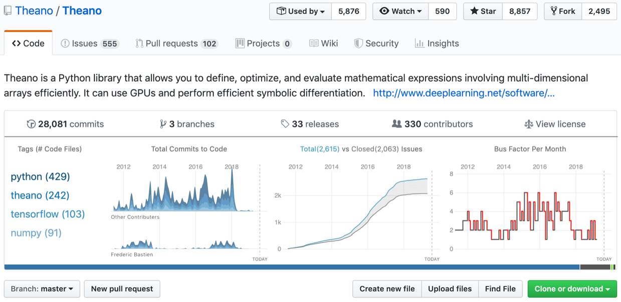
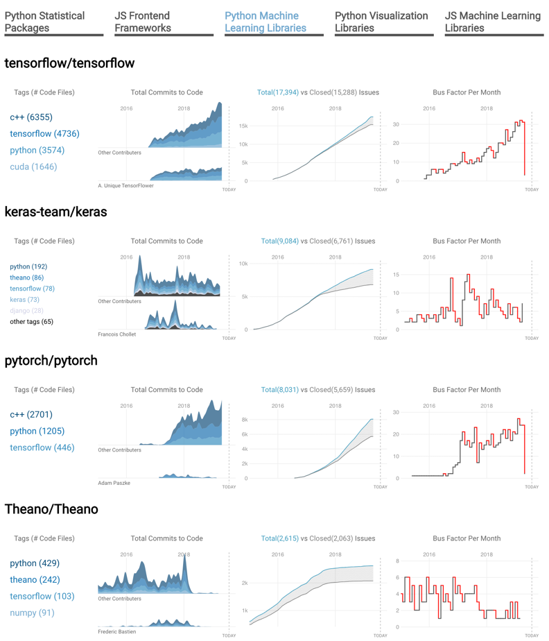
Software engineers regularly encounter problems when choosing an open source library to use for their projects: which libraries represent risks because of their activity levels or underlying technologies? We had multiple conversations with software engineers to fully flesh out concerns that we could address. Then we developed a Chrome plugin to insert a dashboard into GitHub repository homepages to show useful information about the repository’s technologies and activity. This includes a breakdown of the main technologies detected in the repository, commits over time, a burndown chart, and a bus factor chart. We also developed a seperate tool to compare multiple repositories, such as different Python machine learning libraries. We found these prototypes to be very useful, and we believe users would benefit from incorporating this type of information directly into code repository homepages.
Choosing Open Source Libraries and Analyzing Risks
Casey Haber and Robert Gove. “A Visualization Tool for Analyzing the Suitability of Software Libraries via Their Code Repositories.” Visualization and Data Analysis 2020, best paper award. [pdf]